20 Revolutionary Designs of the 20th Century: Iconic Products That Changed the World

The 20th century was a period of unprecedented transformation, when technology, culture, and everyday life were being reshaped at an extraordinary pace. Some inventions didn’t just respond to these changes; they defined them.
From household objects like the Bialetti Moka Pot and Tupperware Wonder Bowl, to icons of mobility like the Volkswagen Beetle and Shinkansen, to revolutionary tools of creativity and communication like the Apple Macintosh and Post-It Notes, the products on this list share remarkable qualities.
They embody democratization, usability, and accessibility, making innovation available to everyday people rather than just the elite. They are functional yet beautiful, practical yet inspiring, often carrying cultural significance far beyond their original purpose.
Many transformed the way people live, work, play, and even think, showing that design is not just about aesthetics or engineering, but about shaping experiences, creating connections, and unlocking new possibilities.
As Dieter Rams said:
“Good design is as little design as possible.”
This principle of simplicity, functionality, and timelessness runs through all the products explored here.
Some of these designs have a timeless quality: they capture the spirit of the era in which they were created, yet continue to feel contemporary, fitting seamlessly into modern life. Across the century, we see a clear shift in design philosophy, from “value-adding,” focusing on appearance or novelty, to “value-driving,” emphasizing how elegantly a product performs its function and enriches the user experience. The inclusion of late-20th-century digital innovations, like Google Search, shows that design can be fully digital yet still transformative.
This is not a ranking, but a chronological exploration of the 20th century’s most iconic designs — products that redefined categories, delighted users, adapted to new needs, and had significant cultural, social, or environmental impact.
Each product reflects at least one of these principles: it adapts to the needs of users, addresses social or environmental challenges, performs well and brings delight, demonstrates real-world impact through adoption or scale, or transforms the way we think about a type of product.
Spanning a century of innovation, this article takes you on a journey through 100 years of truly iconic product designs, showing how thoughtful, human-centered design has changed the world one object at a time.
1) Bialetti Moka Pot (1933)

Designer: Alfonso Bialetti
The Moka Pot is one of the most recognizable symbols of Italian design, created in 1933 by Alfonso Bialetti, and a perfect example of how thoughtful design can transform an everyday ritual into a cultural icon.
The Moka Pot's innovation was fundamentally democratic. Before its creation, authentic espresso was exclusively available in cafés equipped with expensive industrial machines. Bialetti revolutionized this by bringing the complex brewing process into a simple, elegant form accessible to every household. For the first time, espresso became something anyone could make at home.
The design itself is a masterclass in functional modernism. The distinctive octagonal shape isn't merely decorative; it ensures optimal heat distribution and increases structural strength. The choice of aluminum was equally deliberate: lightweight, durable, and affordable, it reflected both postwar material availability and modernist sensibility. Every element serves a purpose.
What makes the Moka Pot particularly revolutionary is how it embodies the principle that good design should be accessible. This wasn't a luxury object for the elite; it was designed for everyone. The brewing process is intuitive: water in the bottom chamber heats up, creates pressure, and pushes through the coffee grounds into the upper chamber. No electricity, no complexity, just physics and thoughtful engineering.
It is worth noting that the Moka Pot also anticipated contemporary concerns about sustainability. It was built to last and to be repaired, not replaced. A single pot could serve a family for decades, passing from generation to generation, an approach that feels remarkably relevant today.
Since 1933, the Moka Pot has brewed coffee on stovetops across the world, becoming as essential as the beverage it makes. It transformed coffee from a café luxury into a daily ritual, establishing itself as part of everyday life not just in Italy but globally. Nearly a century later, its design remains unchanged, a testament to the power of getting it right the first time.
The Moka Pot proves that revolutionary design doesn't require complexity or novelty. Sometimes it simply requires making something essential accessible, functional, and honest. This is design at its most fundamental: solving a real problem with clarity, elegance, and integrity.
2) Volkswagen Beetle Bug (1938)
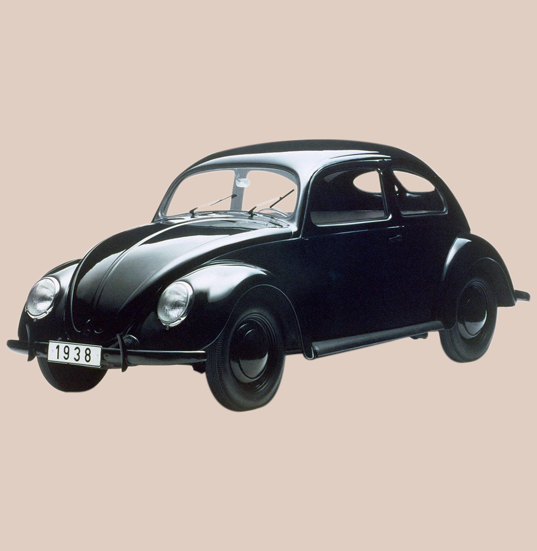
Designer: Ferdinand "Butzi" Porsche
The Volkswagen Beetle, the legendary "Bug," began with the idea of mobility for the masses, but over time it became something far greater: a symbol of a generation, a statement of simplicity, and a timeless design. It’s a car of contradictions, born in the dark political climate of the 1930s, yet remembered as an icon of freedom and optimism in the 1960s.
Its story begins in pre-war Germany, when Ferdinand Porsche (the same engineer who would later create the 911, which we’ll discuss later in this article) was asked to design a Volks-Wagen, literally “a car for the people.” The idea was revolutionary: a vehicle that was simple, affordable, and reliable, accessible to ordinary families rather than the wealthy few.
Although its origins were entangled with propaganda and politics, the concept itself was profoundly democratic, design as social utility, born from the same spirit as Bauhaus functionalism: form follows function, stripped of excess, made for everyday life.
The Beetle’s rounded, almost organic form wasn’t just aesthetic. It was aerodynamic, efficient, and easy to maintain even with basic tools. That insect-like shape minimized air resistance and maximized economy. And yet, that same friendly, curved silhouette would later become its most human feature, a face that everyone recognized and somehow everyone trusted.
The Volkswagen Beetle was produced for more than seven decades, becoming one of the best-selling cars in history. But its real success came from emotion, not mechanics. The Beetle had personality, a car that people didn’t just drive, but loved.
From a tool of propaganda to a global symbol of freedom, the Beetle redefined what a car could mean. It showed that design has the power to transcend history, to reinvent itself, and to connect with people on a deeply human level.
In the end, the Beetle turned mobility into emotion, a small car with a big heart that didn’t just take people somewhere, but became part of their story.
3) Tupperware Wonder Bowl (1946)

Designer: Earl Tupper
The Wonder Bowl was invented by Earl Tupper in 1946 as a lightweight and durable plastic container for storing food. It appeared during the postwar economic boom in the United States, when plastics were beginning to enter everyday products and transform domestic life.
What seemed like a simple household item became a quiet revolution, not only in the kitchen but in the way people organized their homes and approached modern living.
Its airtight seal kept food fresh for longer, a small but groundbreaking innovation in the 1940s. The design reflected the values of postwar modernism: form follows function, combining aesthetic simplicity with clear purpose. Like many revolutionary designs of the 20th century, the Wonder Bowl was not a luxury object but a democratic one, accessible, useful, and made for ordinary people.
Yet the true impact of Tupperware went beyond design. Its success was driven by an equally inventive social model, the famous "Tupperware parties" of the 1950s. Women demonstrated and sold the products in their homes, building communities, confidence, and new opportunities for independence.
The Wonder Bowl became a symbol of domestic modernity and optimism. It showed that a design revolution can be small, humble, and entirely everyday, a simple object that quietly changes habits, culture, and the rhythm of life at home.
4) LEGO Automatic Binding Blocks (1949)

Designers: Ole Kirk Christiansen, Godtfred Kirk Christiansen
The LEGO brick was created by Ole Kirk Christiansen in Denmark in 1949, originally known as the “Automatic Binding Brick.” What began as a simple toy quickly became a revolution in play and design. These small, interlocking pieces could connect securely, repeatedly, and flexibly, allowing for endless creativity and imagination.
In postwar Europe, LEGO reflected a new focus on education, rebuilding, and creativity at home and in schools. Its modular system was both elegant and ingenious: every brick fit with every other, stable and precise, encouraging experimentation and problem-solving. The design followed the same principles that defined many great innovations of the 20th century: simplicity, functionality, and universality.
Made from durable ABS plastic in the 1950s, the bricks were safe, consistent in shape, and built to last. Their clean, rectangular form had no unnecessary decoration, yet held infinite potential. It was a perfect balance between structure and freedom, a system that could be endlessly expanded, adapted, and reimagined.
LEGO became an icon of modular design, proving that revolution can come in the form of play. It blurred the line between toy and tool, showing that good design can educate, inspire, and nurture creativity across generations. A small brick that changed not only how children play, but how we all think about building, imagination, and design itself.
5) Eames DAR Chair (1950)

Designers: Charles and Ray Eames
The Eames DAR Chair emerged in 1950 as part of Charles and Ray Eames' experimental "Furniture for Everyman" project. It arrived during the postwar design boom in the United States, a time when designers sought to create modern, affordable, and functional furniture for a wider public. It represented a shift in how materials, technology, and aesthetics could come together in everyday objects.
The chair combined innovative materials such as molded plastic, steel wire, and plywood to create an elegant yet practical form. Its organic, ergonomic shape was designed to adapt to the human body, offering comfort without excess. Lightweight, durable, and easy to produce, it perfectly reflected the modernist belief that good design should serve both beauty and purpose.
The DAR Chair was also remarkably versatile, fitting seamlessly into homes, offices, and public spaces. It became an icon of mid-century modern design and a symbol of the democratization of style, bringing modern aesthetics to the mass market.
By merging new materials with ergonomic design, the Eames DAR Chair marked a turning point in the evolution of furniture design. It showed that everyday objects could be refined and intelligent, that modernism could be both human and accessible. More than just a chair, it was a statement that design has the power to change how we live, move, and think about the spaces around us.
6) Akari Light Sculpture 1A (1951)

Designer: Isamu Noguchi
The Akari Light Sculpture 1A is a paper lamp created by Japanese-American artist and designer Isamu Noguchi in 1951 that redefined the relationship between light, art, and everyday living. The name Akari means "light" in Japanese, but also conveys a sense of warmth and clarity, qualities that capture Noguchi's vision of balance between nature, material, and modern life.
Made from traditional washi paper and bamboo, supported by a minimal metal frame, the Akari 1A combined ancient craft techniques with modernist sensibility. It was light, delicate, and sculptural, yet entirely functional. Noguchi described his lamps as “light sculptures,” objects that transform spaces not just by illumination, but by atmosphere and emotion.
In a postwar world fascinated by technology and mass production, Akari stood out for its human touch, a reminder that modern design could remain poetic, handmade, and rooted in cultural tradition.
The Akari series bridged East and West, art and industry, showing that innovation does not have to mean abandoning craftsmanship, but rather reinterpreting it for a new era.

Designers: Ludwig Leitz and Willi Stein
Introduced in 1954, the Leica M3 became one of the most influential cameras ever made, a tool that changed photography by uniting precision engineering with intuitive design. Built by the German company Leica, the M3 introduced the now-iconic 35mm rangefinder system, which offered photographers exceptional image quality in a compact, reliable form.
Its design was guided by a clear philosophy: simplicity in service of performance. The camera’s clean lines, perfect proportions, and intuitive controls embodied the principle of “form follows function.”
The M3 was designed for professionals, but its ease of use opened photography to a much broader audience, bridging the gap between technical mastery and artistic expression.
Beyond its technical excellence, the Leica M3 shaped visual culture in the 20th century. It was the camera of choice for photojournalists, artists, and storytellers, from Cartier-Bresson to countless amateurs capturing everyday life. It demonstrated how design could empower creativity, making the camera not just an instrument, but an extension of the eye and hand.
8) Braun SK4 (1956)

Designers: Dieter Rams and Hans Gugelot
Designed in 1956 by Dieter Rams and Hans Gugelot, the Braun SK4 radio-phonograph revolutionized consumer electronics design. Nicknamed "Snow White's Coffin" for its white metal casing and transparent acrylic lid, the SK4 broke radically from the ornate, furniture-like radios of its era.
The SK4's innovation lay in its brutal honesty. While other manufacturers disguised radios as wooden cabinets, Braun made the technology visible. The transparent lid revealed the turntable mechanism, the metal casing proudly displayed industrial materials, and the control panel was organized with clinical precision. There was no decoration, just pure function made visible.
It is worth noting that Rams's design philosophy was deeply influenced by the functionalist principles of the Bauhaus and the Ulm School of Design. This approach stood in stark contrast to 1950s consumer products, where excessive ornamentation often obscured function and created visual noise.
The SK4's rectangular form was determined entirely by its components. Nothing was added for style. The materials were genuine and durable. The layout was logical and intuitive. This was design through elimination, reducing the product to its essential elements.
What made the SK4 truly revolutionary was its lasting influence. It established Braun's design language and created a template that transformed the entire industry. The clean, functional aesthetic we now associate with modern electronics, from Apple products to minimalist audio equipment, traces its lineage directly to this single product.
The SK4 proved that everyday objects didn't need ornament to be beautiful, and that the best design often comes from subtraction rather than addition. This philosophy, later formalized in Rams's "Ten Principles of Good Design," remains remarkably relevant today.
9) 606 Universal Shelving System (1960)

Designer: Dieter Rams
Designed by Dieter Rams for Vitsoe in 1960, the 606 Universal Shelving System is one of the purest expressions of Rams’s design philosophy: functional, timeless, and adaptable. At a glance, it may seem simple: a modular shelving system of aluminum uprights and adjustable boards. But in its simplicity lies genius.
The 606 was designed to evolve with its user. It could be reconfigured, expanded, or relocated with ease, fitting homes, offices, or libraries without losing coherence or elegance. This adaptability made it one of the first truly sustainable furniture designs, an object meant to last not just through durability, but through flexibility.
This is the second of Rams’s designs featured in this list, alongside the Braun SK4, both embodying his “less, but better” philosophy that shaped modern industrial design. His influence extended far beyond Germany, inspiring generations of designers, including Jonathan Ive at Apple, who translated Rams’s principles into the language of digital minimalism.
The 606 remains in production more than six decades later, unchanged in form and purpose. It is not just a shelving system, but a quiet manifesto of Rams’s enduring vision, where utility, clarity, and beauty coexist effortlessly, proving that truly good design never goes out of date.
10) Porsche 911 Carrera (1963)

Designer: Ferdinand "Butzi" Porsche
Designed in 1963 by Ferdinand "Butzi" Porsche, the 911 established a new standard for sports cars: rear-mounted engine, rear-wheel drive, lightweight construction, and excellent aerodynamics. Its design was functional and timeless, combining simplicity of form with precise engineering, characteristics shared by many revolutionary designs of the 20th century.
Additionally, the revolutionary flat-six boxer engine, with its horizontally opposed cylinders, provided a low center of gravity, which improved handling and stability.
It is worth noting that Ferdinand Alexander Porsche's approach to automotive design was shaped by the modernist principles that dominated German design thinking in the post-war period.
Throughout the late 1950s, the automotive industry was troubled by excessive ornamentation and stylistic excess, particularly in American car design. In Germany, which was experiencing rapid economic recovery, designers sought a different path. However, while innovative designers were creating clean, functional forms, many manufacturers preferred to chase fleeting trends and superficial styling exercises.
Many designers believed that form should follow function, and that true beauty emerges from purposeful design rather than applied decoration. This philosophy, deeply rooted in the Bauhaus tradition, found its perfect expression in the 911's design.
The 911's silhouette was defined by its unique proportions: a long hood, a steeply raked windshield, and a fastback roofline that tapered to the rear. The headlights were upright and prominent, giving the car an alert, purposeful expression. Every line served a purpose; there was no decoration for decoration's sake, only pure function translated into form.
What makes the 911 truly revolutionary is its endurance. Over six decades, while the car has evolved continuously, its essential character remains unchanged. This consistency of vision, rare in any industry, proves that great design emerges not from following trends but from unwavering commitment to core principles.
The Porsche 911 demonstrates that true innovation can coexist with tradition, and that timeless design is born from clarity of purpose rather than pursuit of novelty.
11) Olivetti Lettera 32 Typewriter (1963)
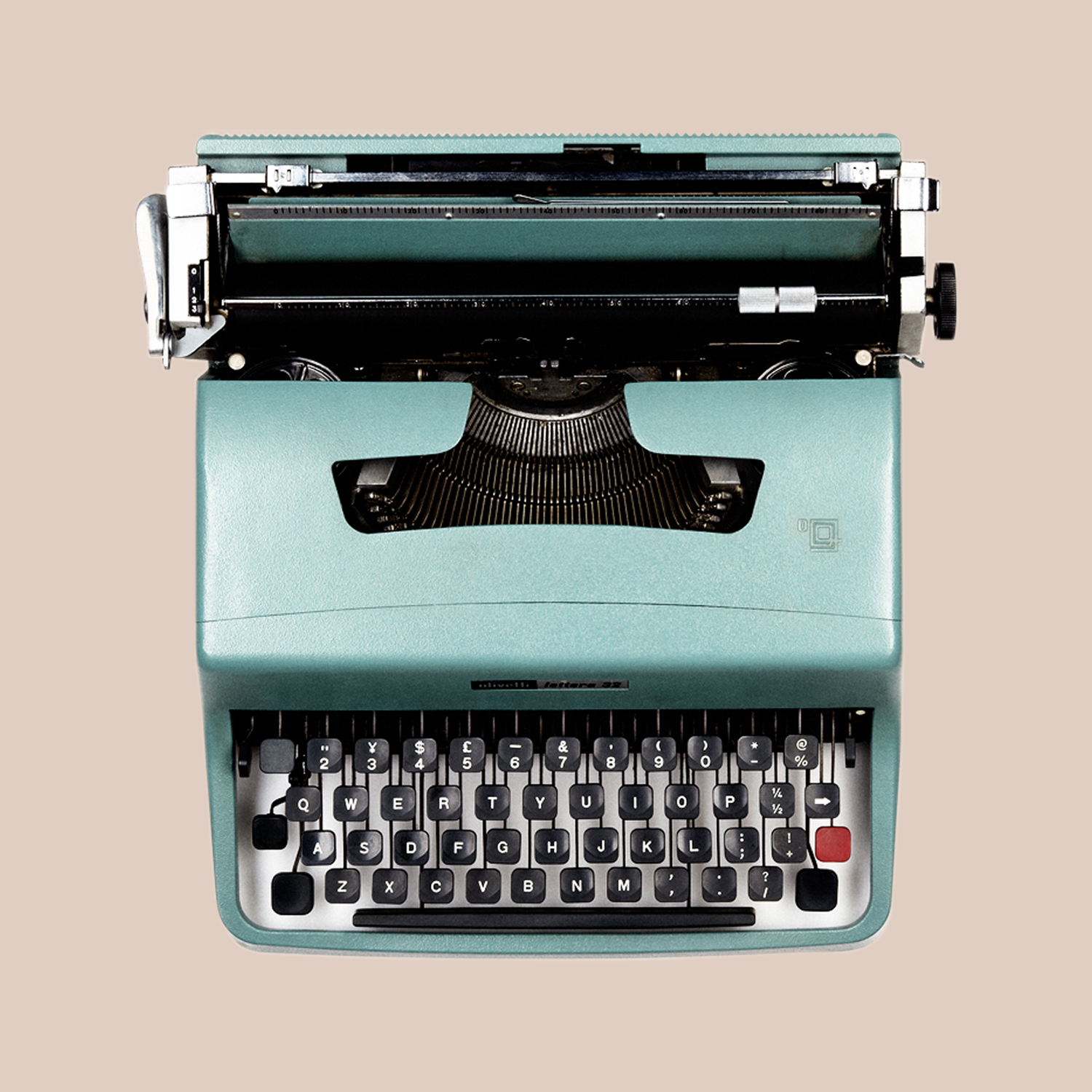
Designers: Marcello Nizzoli and Giuseppe Beccio
The Olivetti Lettera 32, introduced in 1963, is one of the most iconic typewriters of the 20th century. It was a perfect blend of portability, precision, and understated elegance. Designed for writers, journalists, and students, it became a trusted companion for creative minds across generations. Compact, lightweight, and durable, the Lettera 32 embodied the modern ideal of mobility and accessibility, making writing not just a professional act but also a personal and portable experience.
Unlike many machines of its time, the Lettera 32 didn’t come with a bulky manual. Instead, it included a simple instruction card, reflecting its intuitive design. Every detail, from the spacing of the keys to the smooth mechanical action, was carefully engineered for comfort and rhythm. It was a tool that encouraged ideas to flow naturally, connecting mind and machine in a seamless way.
The Lettera 32 also carried the unmistakable aesthetic of Olivetti’s design philosophy: minimal yet warm, industrial yet human. This balance of function and beauty made it more than just an office device. It became a cultural object, found on the desks of thinkers, travelers, and poets.
Another typewriter worth mentioning is the Valentine (1969), also from Olivetti, designed by Ettore Sottsass and Perry A. King. While the Lettera 32 embodied quiet sophistication, the bright red Valentine celebrated creativity and rebellion. Together, they represent two sides of 1960s design: one practical and disciplined, the other expressive and playful. Both prove that even the simplest tools can shape the way we communicate and create.
12) Shinkansen (1964)

Designers: Daisuke Inoue and Japanese National Railways (JNR)
The Shinkansen, also known as the “bullet train,” was designed under the direction of Hideo Shima and launched in 1964. It redefined modern transportation and became one of Japan’s most powerful symbols of innovation and progress. Introduced just in time for the Tokyo Olympics, the Shinkansen marked the beginning of a new era of speed, precision, and national optimism.
More than just a train, it represented the belief that design and technology could work together to transform how people move, connect, and experience distance.
At its core, the Shinkansen was about efficiency and reliability. With its aerodynamic nose, lightweight aluminum body, and meticulous engineering, it achieved unprecedented speeds while maintaining exceptional comfort and safety. The design was both functional and visionary, sleek, purposeful, and instantly recognizable. Every curve and line had a clear purpose: to minimize resistance and maximize performance. It perfectly embodied the modernist idea that form follows function.
The Shinkansen’s influence reached far beyond engineering. It reshaped Japanese society by shrinking geography and redefining the pace of everyday life. Cities that once felt distant were suddenly only hours apart. It connected regions, empowered commuters, and symbolized Japan’s postwar recovery, a living example of design as national identity.
Even today, the Shinkansen remains a global benchmark for high-speed rail innovation. Its legacy is not only technological but also philosophical. It proved that speed can coexist with beauty, that infrastructure can have soul, and that thoughtful design can move entire nations, both physically and emotionally.
13) 747 “Jumbo Jet” Airliner Boeing (Joe Sutter), 1970
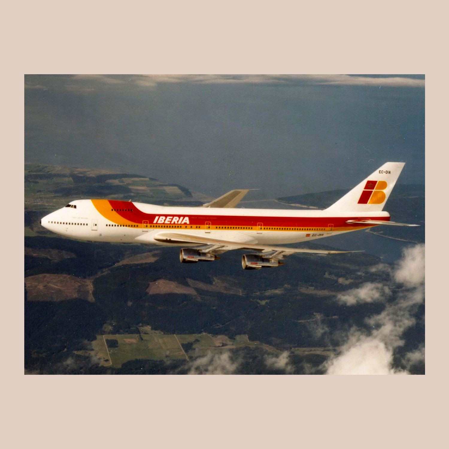
Designer: Joe Sutter
The Boeing 747, designed under the leadership of Joe Sutter and introduced in 1970, revolutionized air travel and redefined the scale of global connectivity. Known as the “Jumbo Jet,” it was the first wide-body commercial aircraft, capable of carrying more than twice as many passengers as any existing plane at the time. Its creation marked a turning point in aviation history, transforming flight from a privilege of the few into a realistic possibility for millions.
The 747’s design was both an engineering marvel and a work of vision. Its distinctive double-deck hump, massive wingspan, and four-engine layout were not only functional but instantly iconic. Behind its monumental scale lay a philosophy of efficiency and inclusivity. The larger capacity meant lower costs per seat, making long-distance travel accessible to the public. The interior, with its spacious cabin and even a lounge area in early models, set a new standard for comfort and ambition in the skies.
Beyond its technical achievements, the 747 became a cultural symbol of the jet age. It embodied the optimism and global reach of the 1970s, connecting continents, cultures, and economies like never before. Airports expanded, tourism boomed, and the world suddenly felt smaller—physically, not just metaphorically.
More than fifty years later, the Boeing 747 remains one of the most recognizable aircraft ever built, celebrated for its beauty, scale, and impact. It wasn’t just a machine; it was a design that changed how humanity saw the planet—from above, together.
14) Polaroid SX-70 (1972)
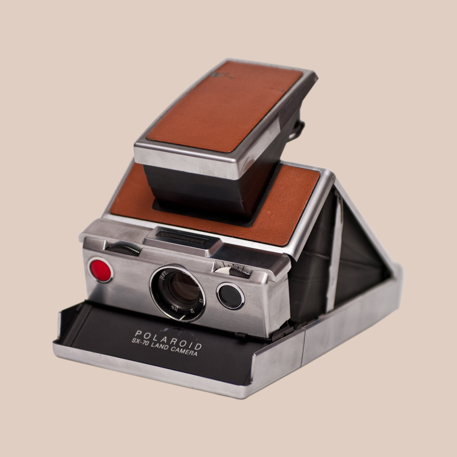
Designers: Henry Dreyfuss and James Gilmore Baker
The Polaroid SX-70, introduced in 1972 and designed by Edwin Land, was a masterpiece of innovation that redefined both photography and the idea of instant gratification. It was the first fully integrated instant camera, a folding single-lens reflex that developed photos immediately after they were taken.
Compact, elegant, and almost magical in its simplicity, the SX-70 turned photography into an experience that was immediate, social, and deeply human.
Technically, it was a marvel. The SX-70 combined a sophisticated optical system with a revolutionary film that developed itself in daylight, with no darkroom and no waiting. Its folding mechanism allowed it to collapse into a sleek, portable form, making it as beautiful to hold as the images it produced.
Wrapped in brushed chrome and leather, it felt like an object of precision and craft, perfectly aligned with Land’s belief that technology should feel natural and intuitive.
Culturally, the SX-70 captured the spirit of the 1970s: creative, experimental, and democratizing. It made photography accessible to everyone, encouraging spontaneity and self-expression long before the digital era. Artists like Andy Warhol and Helmut Newton embraced it, using the Polaroid not just as a camera but as a creative tool and medium in itself.
The SX-70 remains one of the most celebrated examples of design merging art, science, and emotion. It wasn’t just about taking pictures; it was about transforming how people saw and shared their world, one instant image at a time.
15) Post-It Note (1977)

Designers: Spencer Silver and Art Fry
The Post-It Note, created by Spencer Silver and Art Fry at 3M in 1977, is one of the simplest yet most transformative designs of the 20th century. What began as an accidental invention, a weak adhesive that didn’t stick permanently, evolved into a universal tool for organization, creativity, and communication.
It reminds us that not all innovation comes from grand ambition. Sometimes it’s born from everyday curiosity and clever rethinking of what already exists.
The brilliance of the Post-It lies in its perfect balance of form and function. A small square of paper with a strip of low-tack adhesive, it is endlessly reusable, repositionable, and intuitive. It requires no instruction, no manual, just an idea and a surface. This simplicity made it an instant success in offices, schools, and homes around the world, changing how people brainstorm, collaborate, and remember.
Its design also represents the essence of good product thinking: flexibility, accessibility, and delight. Like many revolutionary designs of the 20th century, the Post-It democratized creativity, giving everyone—from engineers to artists—a way to capture thoughts and share ideas effortlessly.
Decades later, the Post-It remains unchanged in both form and purpose, proving that true innovation doesn’t always mean complexity. Sometimes it’s just a piece of yellow paper, small enough to fit in your hand, but powerful enough to change how the world thinks.
16) Sony Walkman TPS-L2 (1979)

Designers: Norio Ohga and Kozo Ohsone
The Sony Walkman TPS-L2, released in 1979, was a cultural and technological milestone that changed the way people experienced music. Designed by Nobutoshi Kihara and his team at Sony, it was the first truly portable cassette player, lightweight, personal, and liberating.
The Walkman didn’t just introduce a new product, it created a completely new way of listening, turning music from a shared, stationary activity into a private and mobile experience.
Technically, the Walkman was an elegant example of miniaturization and simplicity. Stripped of unnecessary features, it focused purely on sound quality and portability. Its clean aluminum body, intuitive controls, and dual headphone jacks (which encouraged shared listening) reflected a design philosophy built on usability and emotion. It was modern, functional, and human, a machine designed for movement and freedom.
Culturally, the Walkman redefined personal space. It allowed people to carry their music wherever they went: on the street, in the park, or on a train. It became a symbol of independence and self-expression, perfectly in tune with the spirit of late 1970s and 1980s urban life. The sight of someone walking with headphones became a universal image of modern individuality.
The Sony Walkman wasn’t just a gadget; it represented a shift in behavior, culture, and perception. It changed how people related to technology and to themselves, proving that great design doesn’t just shape products, it shapes the rhythms of everyday life.
17) Apple Macintosh (1984)

Designers: Jef Raskin, Jerry Manock, Terry Oyama, Andy Hertzfeld, Burrell Smith, Steve Jobs
The Apple Macintosh, released in 1984 and designed by Hartmut Esslinger and his team at Frog Design, marked a defining moment in the history of personal computing. It wasn’t just another machine; it was a reimagining of how humans could interact with technology. At a time when computers were mostly used by specialists, the Macintosh brought the digital world into homes, studios, and classrooms, making computing personal, visual, and intuitive.
Its most revolutionary feature was the graphical user interface (GUI), a bold shift from the text-based command systems that dominated the era. Instead of typing complex codes, users could click on icons, open windows, and navigate with a mouse. This simple, human-centered interaction changed everything, turning technology into something accessible and even friendly.
The design of the Macintosh reflected the same philosophy: compact, clean, and approachable. Its beige plastic shell and built-in screen were both functional and symbolic. Technology was no longer a cold machine hidden in an office. It became a creative tool that could sit comfortably on a desk. Inside, it carried impressive innovation for its time, 128K of RAM (later upgraded to 512K), enough to run groundbreaking applications like MacPaint and MacWrite, which redefined digital creativity.
Beyond the hardware, the Macintosh represented a new design culture that combined technology with emotion and engineering with storytelling. Its launch, famously accompanied by Ridley Scott’s “1984” commercial, presented the computer not as a product but as a symbol of liberation and individuality.
Decades later, the legacy of the Macintosh lives on in every Apple device that followed. It laid the foundation for a design philosophy later advanced by Jonathan Ive: minimal, intuitive, and deeply human.
The 1984 Macintosh didn’t just make computers easier to use, it redefined what technology could mean in our lives. It marked the beginning of a dialogue between people and machines that continues to shape how we live, work, and create today.
18) Google Search Engine (1997)

Designers: Larry Page and Sergey Brin
The Google Search Engine, created by Larry Page and Sergey Brin in 1997, marked one of the most profound shifts in design at the turn of the 20th century. It was a revolution not of form but of function.
Emerging at a time when the internet was growing at an explosive pace, Google redefined how people find, organize, and understand information. It wasn’t a physical object, but its impact on daily life was as real as any product of its time.
What made Google Search revolutionary was its simplicity. The homepage was almost empty, with no clutter and no distractions, just a logo and a search box. This minimalist approach wasn’t a lack of design but a mastery of it. It focused entirely on purpose: helping users find what they were looking for as quickly and accurately as possible. It was design reduced to its essence, clean, invisible, and powerful.
At its core was PageRank, an algorithm that evaluated the relevance of web pages by analyzing their links and relationships. This system transformed the chaos of the expanding web into an organized and meaningful experience. What once took minutes or hours could now be achieved in seconds, with results that felt intuitive and almost human in their accuracy.
Google Search proved that design could be entirely digital and still revolutionary. It shifted the focus of design from physical products to user experience, from how something looks to how it works. Its clarity, efficiency, and accessibility made it a natural part of everyday life for billions of people.
By the end of the 20th century, Google had achieved what few designs ever do: it became invisible. It blended so seamlessly into modern life that most users no longer thought of it as a product, but as an extension of thought itself, the perfect example of design serving human need.
19) Netflix Streaming (1997)

Designers: Reed Hastings and Marc Randolph
Netflix, founded by Reed Hastings and Marc Randolph in 1997, began as a DVD rental service by mail but soon became a pioneer of the streaming era. This shift redefined how the world consumes media. Its transition from physical distribution to on-demand streaming in the mid-2000s marked one of the most important transformations in digital design and user experience.
What made Netflix revolutionary was not just its technology but its vision of accessibility and personalization. It removed the limits of time and place, so viewers no longer had to follow broadcast schedules or visit stores. The interface was designed for simplicity and ease of use, focused on discovery and enjoyment. Personalized recommendations powered by algorithms made watching feel dynamic and tailored to each user.
Netflix also changed the relationship between design and content. The platform’s clean layout, continuous playback, and seamless experience across devices made watching films and series effortless. It was a design that quietly stepped back, allowing the experience itself to shine, proof that great digital design enhances immersion by staying invisible.
By turning entertainment into a fluid, on-demand experience, Netflix helped define the streaming age. It showed how design could go beyond visual form to include systems, behavior, and culture, reshaping not just how we watch but how we think about media itself.
20) Nokia 3210 (1999)
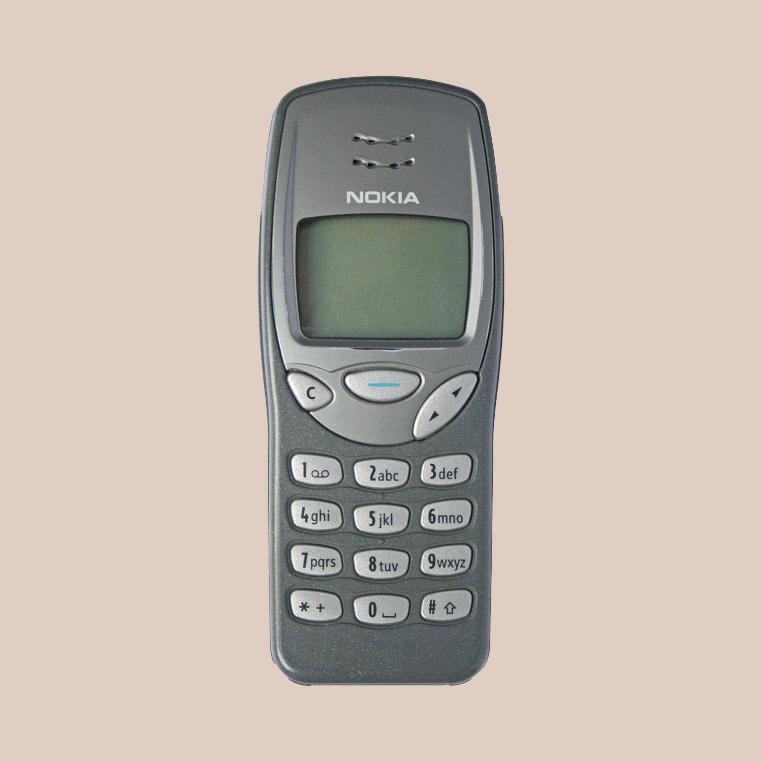
Designer: Alastair Curtis
The Nokia 3210, launched in 1999, is one of the most iconic mobile phones of the 20th century. It was the device that brought mobile communication to the masses.
Designed by Alastair Curtis at Nokia’s Los Angeles Design Center, under the direction of Frank Nuovo, the company’s Vice President and Chief of Design, the 3210 quickly became a global success. Curtis later said it was his favorite Nokia phone because it was his first design to reach the market.
The 3210 was the first phone to sell more than 100 million units and is often seen as the peak of pre-smartphone design. It introduced a fully integrated internal antenna, which made the phone sleeker and easier to carry. Its compact, durable form and intuitive interface made it simple to use, while the tactile keypad encouraged texting. Preloaded games like Snake became global sensations and helped define a generation of mobile users.
More than just a gadget, the 3210 became a cultural symbol of connectivity and independence. It appealed to all generations and helped turn the mobile phone into an everyday essential rather than a luxury. Its long battery life, sturdy build, and interchangeable covers made it both practical and personal.
The Nokia 3210 represents a key moment in design history when technology became truly democratic. It combined functionality, usability, and emotional connection, proving that great design is not about complexity but about creating something simple, reliable, and meaningful for everyone.
Summary
Throughout the 20th century, product design evolved from focusing on decoration and form to emphasizing function, purpose, and the user experience. Movements such as Bauhaus and later postmodernism helped shift attention toward how products serve people and improve daily life. This change marked the beginning of human-centered design, where creativity and technology meet real human needs.
The timeline of 20th-century design reveals a series of iconic products that transformed industries, introduced new technologies, and reshaped everyday habits. Each of these designs reflects a clear understanding of people, their routines, desires, and challenges, turning simple ideas into lasting innovations.
Looking back at these twenty designs, one idea stands out: good design is about people. Each object, from the Bialetti Moka Pot to the Nokia 3210, represents a moment when innovation and human need came together in perfect balance. Whether it was making coffee, capturing memories, traveling faster, or connecting across distances, every product on this list helped shape how people live.
Together, they tell a story of progress that is not only technological but also cultural and social. The Volkswagen Beetle, Shinkansen, and Boeing 747 changed how people move across the world. The Eames Chair, Akari Lamp, and Braun SK4 redefined modern living with simplicity and beauty. The Polaroid SX-70, Apple Macintosh, and Sony Walkman encouraged creativity and self-expression. Later, digital designs like Google Search and Netflix streaming showed that design could exist in systems and experiences, not only in physical form.
All these designs share the same values: simplicity, empathy, and purpose. They are not great because they are complex, but because they feel natural and easy to use. They solve real problems and bring small moments of joy. Good design does not demand attention; it quietly makes life better.
The 20th century was not only a time of invention, but also the birth of design as a human language.
If you found this article intriguing or are interested in collaborating, feel free to connect with me on Twitter or visit my personal website.